How to design better posts for Instagram

Welcome to this five-part series of helpful tips and tricks to improve your D.I.Y design skills for a more follow-worthy social media presence.
But first, let’s get serious for a moment… when you’re looking into a business or brand you’ve just found, or a new restaurant your friends have booked for your next gathering, how often do you head over to their Instagram feed to really suss them out. To see what they’re really like. If they have a messy disjointed feed, designs that look like they were created with Microsoft Word (or Paint!) or no new posts since Adele first sang “Hello” - it can be a big warning sign. That they’re out of touch with their customers, confused about who they are, or not fully invested in their overall presentation.
However, knowing the positive impact that a good social media presence can have on a brand, we’ve compiled these 5 key tips with small biz owners in mind who create their own posts (most often in Canva) and want to know how to make their Instagram feed look more professional and considered, while picking up some basic design principles along the way.
So, if you want to have a social media presence that is not only beautiful to look at but one that people genuinely want to follow and share what you have to offer - then grab a cup of coffee and a notepad and let’s get started!
IG Tip #1: Consistency is key
First up we're looking at possibly the most important topic of brand design... CONSISTENCY. Because no matter what your actual brand elements are, as long as you use them consistently, you'll build brand recognition, and recognition builds trust.
** The Golden Rule: Consistency is more important than perfection.


✦ POINT 1: Keep using the same fonts
A strong brand doesn’t change its fonts like the weather. Establish 1 - 2 fonts (3 at max, if you really must) and stick with them!
Have one main font that you use 80% of the time along with an accent font to add occassional pops of interest (more on this in Tip #2).
✦ POINT 2: Use the same set of colours, and try different intensities
Establish about 3 - 8 cohesive colours that you can rotate through to add variety to posts, while staying consistent overall. Use various tones/intensities of the colours in designs to get more options out of your colours. E.g. Try layering a 70% lighter tone of one of your colours to use as a background behind your text that is set to 100% (see examples in above slide).
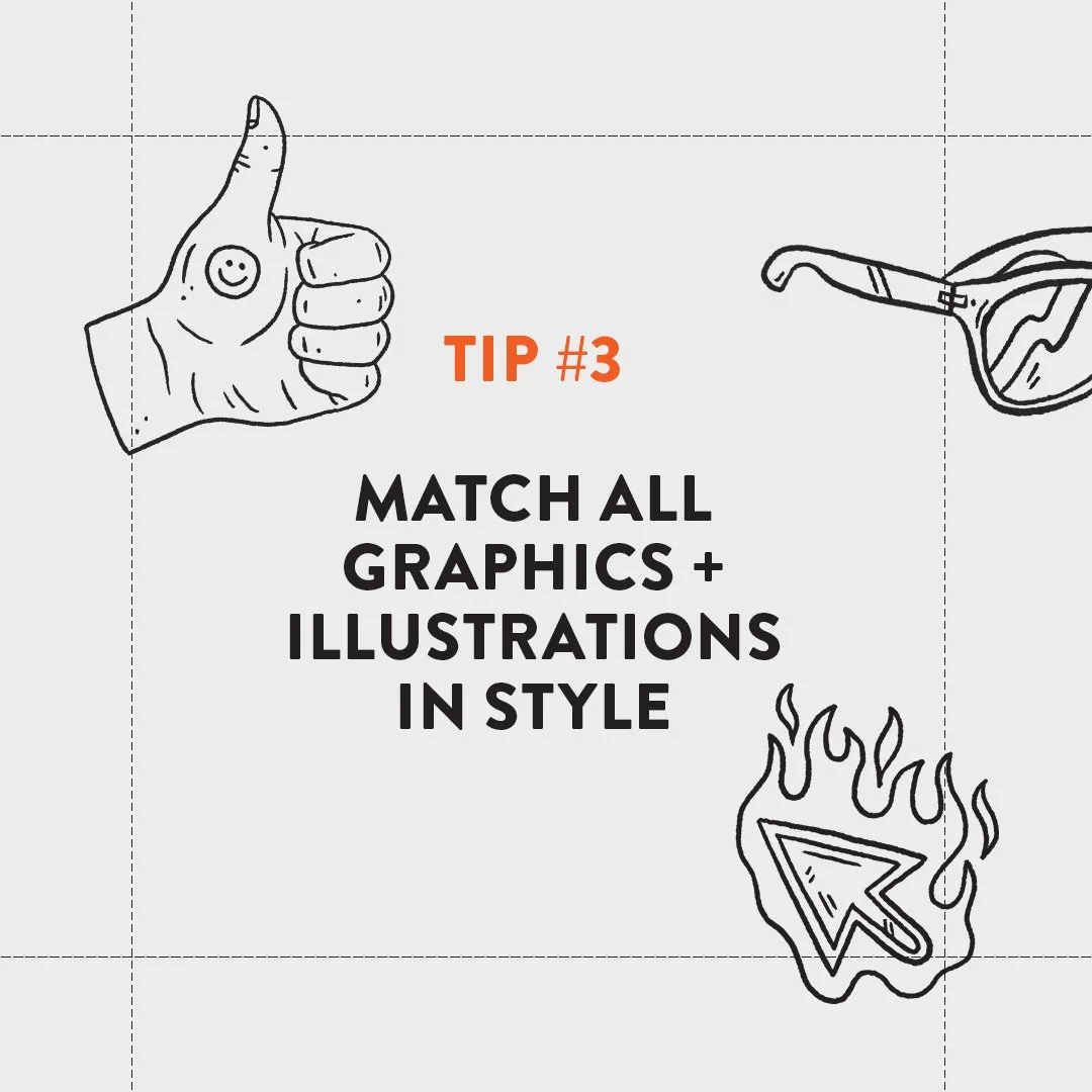
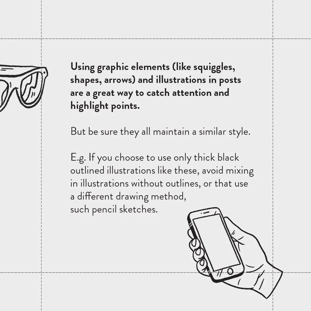
✦ POINT 3: Match all graphics and illustrations in style
Using illustrations and graphic elements (like squiggles, shapes, arrows) in your posts is a great way to catch attention and highlight points. But be sure they all maintain a similar style. E.g. If you choose to use only thick black outlined illustrations, avoid mixing in illustrations without outlines, or that use a different drawing method, such pencil sketches vs vector shape characters.
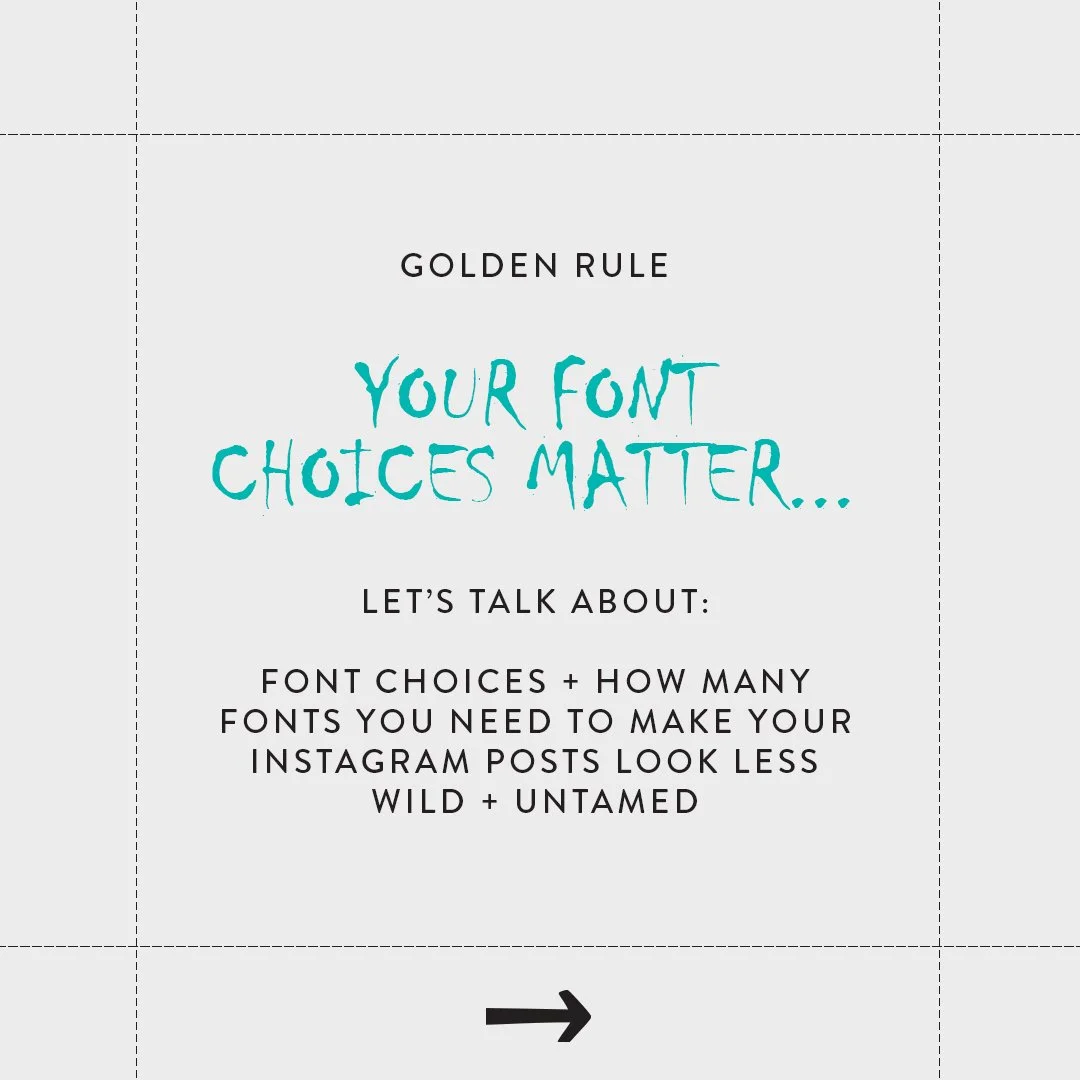
IG Tip #2: How to use fonts
Let’s talk… FONTS! How many you should use, which types to use and how to use them consistently (which we touched on in the previous tip).
** The Golden Rule: Your font choices matter.


✦ POINT 1: Limit the number of fonts you use
It’s true, Too many fonts do spoil the broth design. Establish 1 - 2 fonts (3 at max, if you really must) that compliment your brand’s personality and are easy to read. Your font choices shouldn’t overpower a design or distract from the message by being too distracting.
✦ POINT 2: Balance one primary font with one accent font
A Primary font is the default and more “practical” font.
Use this main font about 80% of the time in your designs. Make sure it’s one that comes with different weights (e.g. light, regular, bold) and has italics so it can be used as headings, paragraph text and quotes etc.
Sans-serif fonts (like this one) are often used for modern, clean, progressive and more relatable brands. Serif fonts (like Times New Roman) help brands feel more formal, established and trustworthy. As the Gold Rule states… Your font choices matter! They convey specific feelings.
An accent font is the “fun” one - the glitter.
The accent font is there to add a little bit of sparkle and extra personality to a design. Just like glitter, it should be used sparingly and not necessarily in every design. Common accent font options are: Script fonts, handwritten fonts or display fonts (see slides above for examples of each).
✦ POINT 3: Whichever fonts you choose: Use them. And use them consistently.
At the end of the day, consistency is your best bet. Make sure you stick to your chosen fonts and let them become a recognisable brand element.
IG Tip #3: The importance of margins
You know that empty space left open around the border of a page/post so nothing is cut off or squished to the side? Those are margins.
Margins are part of basic design layout 101 - add in margins to your next design and boom! #Dezigner
** The Golden Rule: You need margins.


✦ POINT 1: Align. Align. Align.
Setting up margins, about 1-2cm in width around all edges of your post (if you’re in Canva: File > show margins) will help give your design room to breathe. It’ll also provide you with guides to align your text and elements to in a straight line (e.g. aligning everything to the left against the margin will give a clean and easy-to-read layout).
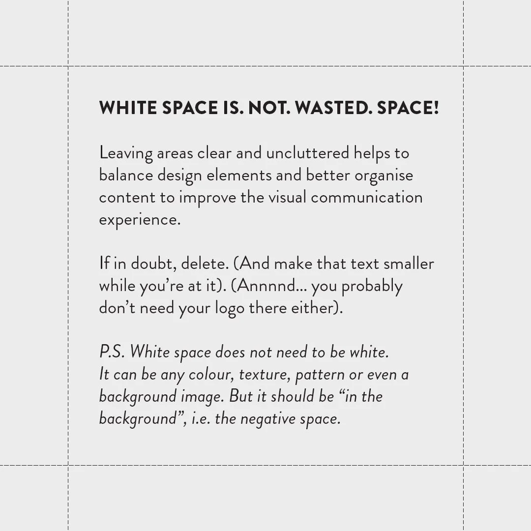
✦ POINT 2: Whitespace. Is. Not. Wasted. Space.
White space = empty space = good space!
Also known as “negative space” - white space is the space left empty around the content in a design. It allows your design to breathe by reducing the amount of text and elements the reader sees at once. By using margins, it makes adding white space to your design quick, easy and super effective.
(More on whitespace in the next tip)
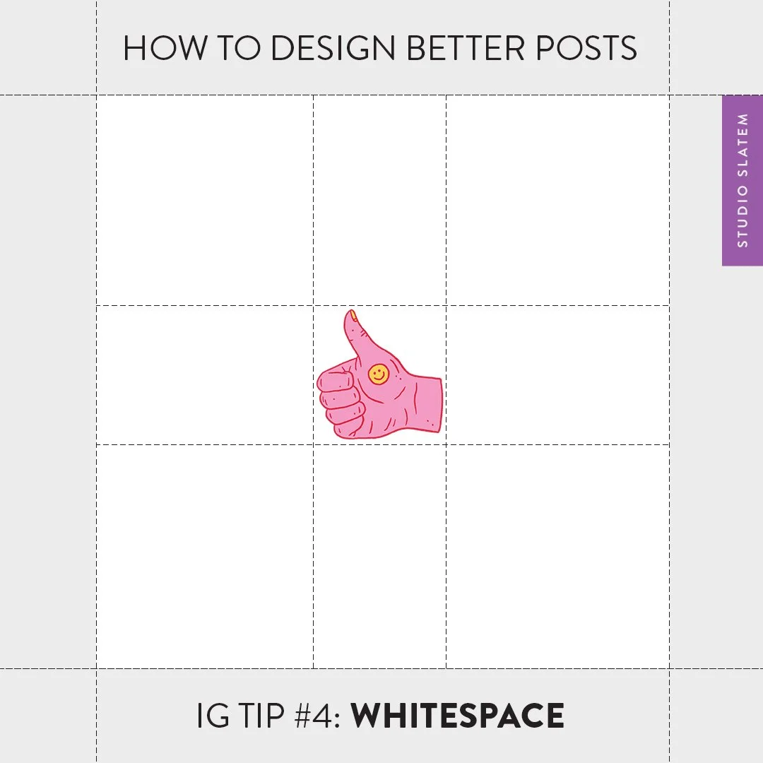
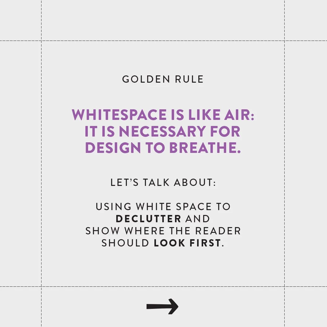
IG Tip #4: Including whitespace
Whitespace is the area/s left open and free of clutter on a page that helps calm down the eye and lead it where it should go.
The Golden Rule: Whitespace is like air: It is necessary for design to breathe.


✦ POINT 1: Mary Kondo that design.
Get rid of the junk on your page to make room for more calm (i.e. the whitespace).
Often we have a lot we want to say in a post and we don’t want to waste a single pixel of ‘unused’ space. We end up putting everything, plus last night’s left overs, into the design. Making the text as big as possible and leaving no space for the viewer to rest and contemplate what they’re looking at. But, it’s important to remember that white space is not wasted space!
Leaving areas clear and uncluttered helps to balance design elements and better organise content to improve the visual communication experience. If in doubt, delete. (And make that text smaller while you’re at it). (Annnnd... you probably don’t need your logo there either).
P.S. White space does not need to be white. It can be any colour, texture, pattern or even a background image. But it should be “in the background”, i.e. the negative space.

https://learn.co/lessons/hs-design-principles-hierarchy
✦ POINT 2: Build a hierarchy of importance.
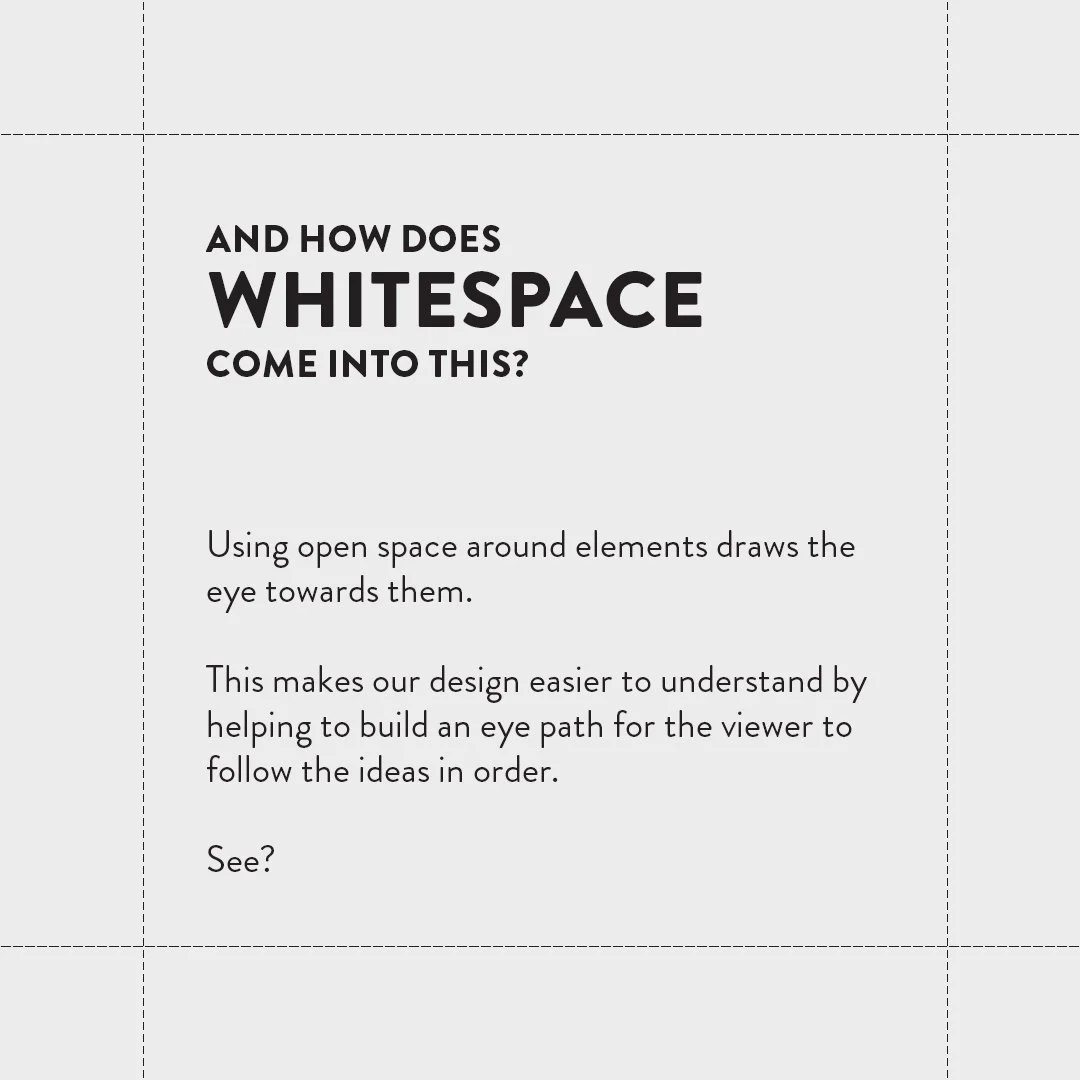
Hierarchy in design uses arrangement on a page to show the order of importance. I.e. Arrange elements on a page (through placement, colour, scale or white space) to make specific elements on the page catch your eye first, rather than it being a mash of clutter and no chosen “leader”, for example shown right.
And how does whitespace come into this?
Using open space around elements draws the eye towards them. This makes our design easier to understand by helping to build an eye path for the viewer to follow the ideas in order.
IG Tip #5: Considering the grid
** The Golden Rule: Use structured grid layouts (within reason) to make a positive first impression.
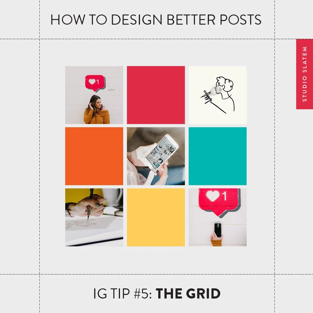


✦ POINT #1: Add ordered variety and design flair with a checkerboard effect
The checkerboard layout is a visually powerful but easy-to-maintain grid option.
While there are many more structured (and higher commitment grid possibilities out there) this one is my fave. Simply alternate photographs with text-based posts (see examples in the above slide). Try to avoid using the same colour block for text posts consecutively to add more variety. However, if maintaining a grid is sucking the last remaining joy out of keeping consistent on social media... perhaps give this one a skip.
✦ POINT #2: Make life easier. Use a content planner.
Whether you choose to stick to a set layout or just want to post more consistently - a content planner is your bestie! The best part of using a planner is that you can (and I highly recommend to) batch plan your IG posts in one go. You can pop in all the images for the week/month/the future, write the captions for them, play around with grid layout and then schedule them to post automatically on a specific day and time. Easy!
Some great planners with free versions:
Recap on How to Design Better Instagram Posts:
Tip #1: Consistency is key
Tip #2: Using Fonts the right way
Tip #3: Implementing Margins
Tip #4: Including Whitespace
Tip #5: Considering The Grid

Or are you ready to level up your social game and sky-rocket your engagement with done-for-you custom templates with your very own exciting branded assets, like illustrations and gif stickers?
Let me take that off your plate and renew your enthusiasm for Instagram today!